What is this now? The seventh or eighth Nezumi I’ve reviewed? I’m losing count but not interest. There’s something still so satisfying about Nezumi’s design language that now seems all the more imperative given the presence of a mechanical Nezumi Voiture on the market as of March 2022. What could the future hold for this Swedish design studio as it transitions into a more serious player in the mechanical watchmaking realm?
For those of you that don’t know, I’ve been collecting Nezumi watches since it all began. The very first Nezumi watch project launched on Kickstarter in 2015. The project almost doubled its target and went on to satisfy its 243 backers. There was also cause for some amusement, given a slightly humorous dial misprint caused by switching dial suppliers at the last moment. Instead of “quartz”, the dial reads “quarts”, which was, and remains, my favorite thing about a superb watch I’ve never tired of wearing.

Being part of a brand’s story is always fun. Witnessing those growing pains firsthand sires an unbreakable bond. I’ve been a vocal supporter of the brand since its early forays into watchmaking, and now, the best part of a decade later, I’m still buying them like there’s no tomorrow. I’ve got three Voiture models, two Corbeaus (including this one), an automatic Baleine, a bright blue Loews, and a Tonnerre. You’d think with one wrist and 70 other watches, my humble hoard of meca-quartz watches would never get worn, but that isn’t the case. They are the watches I turn to for lazy summer days, nights out on the town, idling bike rides, and trips abroad. They are reliable, robust, and ready for anything. And this model, with its muted gray dial, goes with just about anything.

A foot in the past
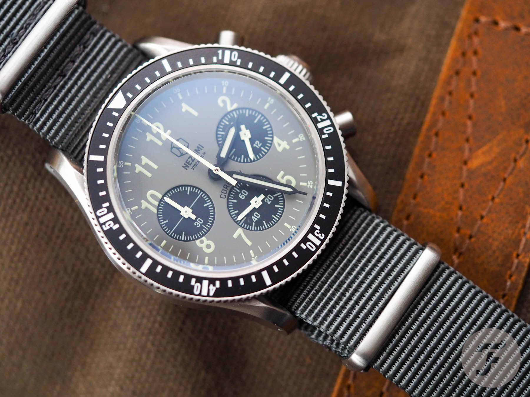
Did you know that Nezumi regards the Corbeau line as its mil-spec-inspired watch? Its design has its roots in the “Viggen” Lemania watches supplied to the Swedish Airforce once upon a time. This model, Corbeau reference CQ3.102, is my new favorite of the three available colorways. My first Corbeau is no longer in the collection and is markedly different from this piece. Instead, it’s more similar to the reverse panda reference CQ3.202, which clearly replaced it in the collection.

My old model had white hands and yellowy lume, whereas the new models have black hands and green lume, which very much adds to the military vibe this collection is doubling down on. The third available reference in the current collection is reference CQ3.702, which has an all-black dial and bezel, green lume, and an orange seconds hand. It’s my least favorite, and if I’m being straight-up, I don’t like it at all. I think the model sings with contrasting sub-dials and, in their absence, I don’t find anything about reference CQ3.702 to get excited about.

The Corbeau goes with gray skies or blue
This watch is a versatile beast. It is lightweight thanks to its gray fabric NATO strap and VK63 meca-quartz hybrid movement from Seiko. It measures just 40mm across and 13mm thick (including the double-domed crystal). The stainless steel case is 47mm from lyre lug to lyre lug and could take any 20mm strap you choose to pair with it, thanks to that incredibly neutral color palette on the dial.

Talking of strap changes, this model is certainly made for those who like to regularly cycle through watch bands. The lugs are drilled through to make scratch-free exchanges a doddle. The 50m water resistance is sufficient for a daily beater, and the €359 asking price is not high enough to keep you from putting it through its paces, whatever the weather.

Is it better than the old version?
You know what? I hope this doesn’t seem like a push, but it’s a tie. These watches, while fundamentally similar, have very different characters. I was surprised to find out how far apart they were. You wouldn’t think it from the specs (which are basically identical), but it’s true. One watch is warm and inviting, while the other is a steely-eyed killer. Oddly, I like them both for what they are and struggle to pick a favorite. I think novelty is leading me to pull this gray Corbeau model from the box more often than its forerunner, but time will tell.
#gallery-1 {
margin: auto;
}
#gallery-1 .gallery-item {
float: left;
margin-top: 10px;
text-align: center;
width: 33%;
}
#gallery-1 img {
border: 2px solid #cfcfcf;
}
#gallery-1 .gallery-caption {
margin-left: 0;
}
/* see gallery_shortcode() in wp-includes/media.php */
Boxing above its class
Beyond the watch itself, there is a really major upgrade to the presentation of the Nezumi Corbeau chronograph. I’ve always, always been a fan of the smart and simple way Nezumi packaged its watches. The boxes were cute, no-nonsense, and collectible. They were always an excellent way to do something cool for cheap. However, along with the subtle improvements to the watches, so too has Nezumi founder and designer David Campo been working on upgrading the packaging.
Only these upgrades are not subtle. They are astoundingly obvious. Just a couple of weeks ago, I commented on how poor packaging let down the inaugural launch from Hesili New York. Here, the opposite is true. Having been coincidentally presented with two such perfect examples of how the unboxing experience — something to which I’d previously thought myself immune — can affect those split-second expectations of what might lay within, I have decided it matters.
Here, Nezumi maintains its cartooned exterior box but adds a stylish flip-top hard box with a Nezumi medallion sunken into the surface for good measure. Did I need it? No. Do I love it? Yes. I am consistently impressed at how Nezumi finds ways to add value to a package that retails for €359.
#gallery-2 {
margin: auto;
}
#gallery-2 .gallery-item {
float: left;
margin-top: 10px;
text-align: center;
width: 50%;
}
#gallery-2 img {
border: 2px solid #cfcfcf;
}
#gallery-2 .gallery-caption {
margin-left: 0;
}
/* see gallery_shortcode() in wp-includes/media.php */
The addiction is real
I think what I like most about the new reference is just how neutral the palette is. The old one always seemed very inoffensive to me, and given the slightly yellowish tone of the old brown NATO teamed with the black dial, I didn’t feel too bad wearing it with a black belt or boots. Here, however, with the newer model, the gray is completely flexible. It feels at home with brown shoes. It feels at home with black shoes. While the unavoidably militaristic vibes favor the latter, it does offer true versatility. And for less than €400, I must commend Nezumi for keeping things fresh and giving me, a long-time customer, reasons to return again and again.
One of these days, I’ll need to curb my addiction to this burgeoning brand and share my collection with my friends so they too can enjoy it the way I do. But today is not that day. And tomorrow isn’t looking good for it either… Learn more about Nezumi by visiting the brand’s official website here.








Comments