Ants. Well, what can I say? I’ve been in this game a while, and that’s a new one for me. However, I must admit it beats the painfully strained nonsense poured into many of the press releases we receive. Honestly, it gets out of hand with claims that the “latest shade of blue” takes inspiration from “the kiss of a cool easterly breeze on the third Wednesday in March when standing barefoot on a rock 73% covered in moss”, or something similarly ridiculous. At least Ryan Lee, the founder of Biotic, just came out and said it: he likes ants, and, so, here is his ant watch. Surprisingly, the Formicidae is a lot better than its inspiration suggests…
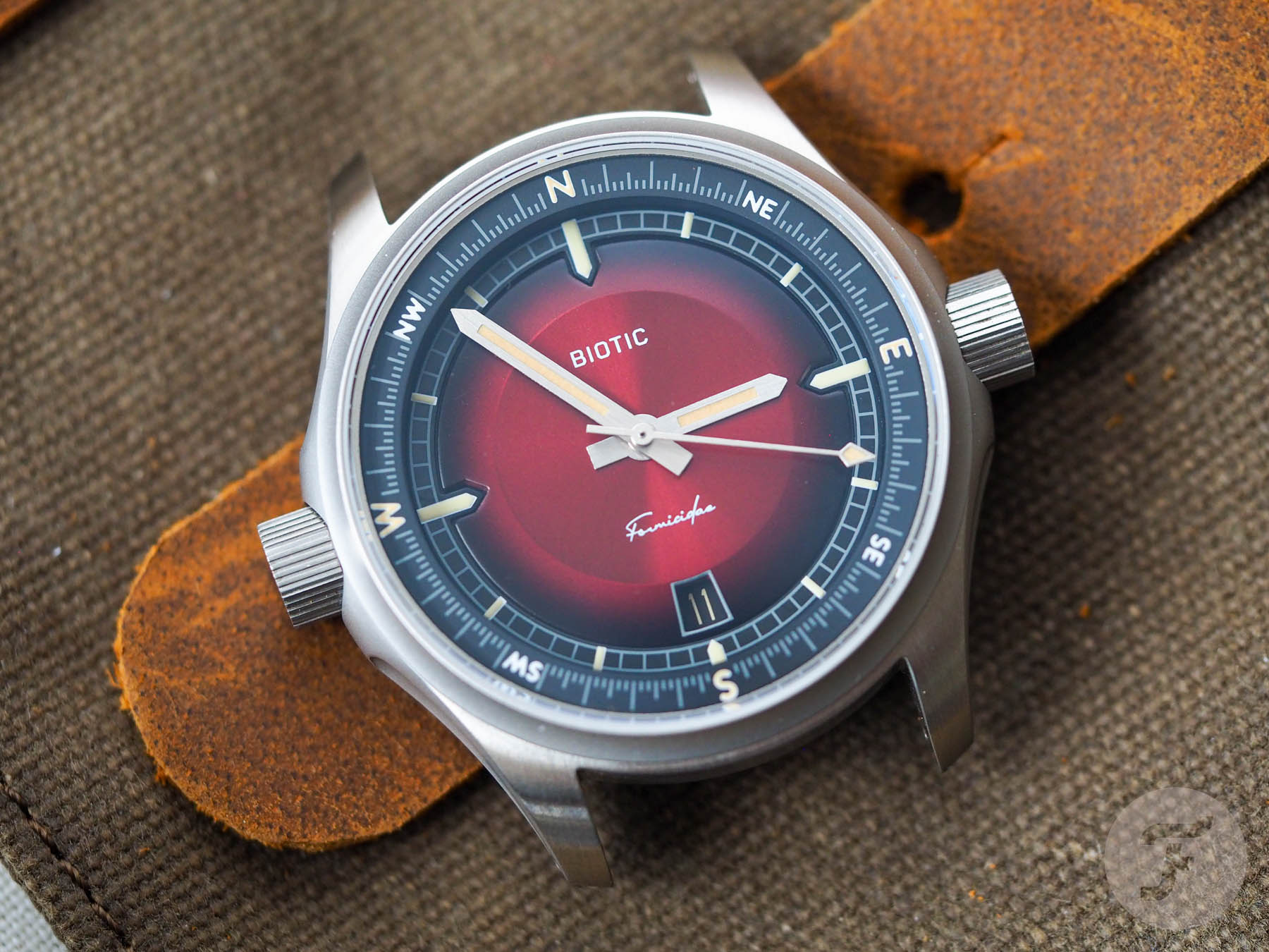
Let’s address the elephant in the room before going further: this watch has big ears. I’m not sure if I should say that in this politically correct age, but it’s too late now. Did you know that in the American dub of Noddy: Toyland Detective the character of Big Ears has been renamed Mr. Squeaks to avoid offending anyone with big ears? I’m not sure why no one in the ivory tower cares about people with squeaky voices, but whatever. At least in the US, the nickname “Big Ears” is currently available, so I suggest you apply it to the Biotic Formicidae.

Changes to come
Despite drawing attention to that element, I must point out that this example I have hear — sorry, here — is a prototype. A couple of changes (including an ear reduction) will take place before the final production run gets underway. Along with the crowns receiving a pronounced “step” to reduce their visual impact, so too will the minute hand be shortened (much to my dismay), the degree scale on the internal rotating compass bezel will be corrected (it currently does not show the right amount of degrees and needs more dashes added to it), lume will be added to the date wheel, and the space between the crown and the case will be reduced.

I swore I’d never do this again…
I must apologize. A while back, I had a truly abysmal experience with an equally abysmal prototype that the owner claimed would magically transform from a pumpkin into a carriage the moment it hit its Kickstarter funding goal. After that, I vowed I’d not review prototypes again because, well, what is it that I’m reviewing? Am I reviewing a watch or the idea of what a watch could be? It’s difficult for me to give a fair and reasoned analysis of a product when I haven’t seen the product you might be spending your hard-earned cash on. I am, however, a bit of a soft touch, so I agreed to review this model after making it clear I would hold nothing back in my initial assessment of the concept, at least.

When it comes to prototypes, it’s fair to assume nothing will get worse. So, if something is already good, it’s probably safe to assume it’ll still be good when the brand starts production. However, for the areas that need improvement, we must (or must not) take a leap of faith.

What looks to be very good
The dial is delicious. I chose the red (fire) version for this review, and I have to say it’s excellent. This watch will not have a fearsome retail price — usually US$599 with a Super Early Bird launch price of $399. It amazes me that some brands at this price point (or even significantly above it) aren’t able to get such a nice-looking dial result out of their investment.

This matte sunburst is a lovely finish that we see too seldom. I do like the visual interest of a sunburst dial. Generally, however, I find them to be a bit glossy, a little ubiquitous, and often cheaply done. Here, all of the flashiness is removed. Instead, you get the shimmering interplay of light and dial that a regular gloss sunburst would offer but in a less distracting fashion.

The convex dial shape with cut-outs for three of the four luminous cardinal markers is also a triumph of design. I cannot express enough how blowing the budget on a component like this is exactly the right thing to do. Now, in all honesty, I know the big-eared look is what this watch is all about. Still, I’m sure the Formicidae would instantly be ten times better if the compass crown shifted to 2 or 4 o’clock. Why? Because the dial is good enough to sell the whole package. It doesn’t need the gimmicky symmetry (which always seems like a better idea at first than it turns out to be).

Experience talking
And I say that from personal experience. For years, symmetry was my ultimate obsession. I thought it was the be-all and end-all of watch design. But I was wrong. I was, I believe now, very wrong. I get that it’s an attractive idea. In fact, it’s so compelling that you might even find yourself believing you’ve cracked “it” (“it” being the Holy Grail of watch design). And, if you allow yourself to fall even deeper into the clutches of the idea, you might find yourself naively believing that no one else in the history of watchmaking has thought of the same thing before!

How could that be possible, you wonder? Well, it isn’t possible. Pretty much everyone that has picked up a pen in the hopes of scribbling down a classic in a moment of inspiration has toyed with the notion. The idea of symmetry is almost always abandoned because it doesn’t make for an ergonomically pleasing watch. And, as any experienced designer will tell you, a primarily functional object’s form should follow its function. And one of the key functions of a watch is being wearable.

ANTidote to boredom
However, we should analyze each concept on its merit; this concept is implicitly built around the idea of the humble worker ant. Those two crowns bulging out of the case may look like ears to me, but they could easily nod to the eyes or antennae of an ant. They make the silhouette of the case recognizable. Maybe not for the best of reasons, but it is recognizable nonetheless. And just because I don’t dig the idea of crowns at 3 and 9 o’clock when the crowns are this prominent doesn’t mean it doesn’t “work” as a concept.

In profile, the case is similarly ambitious. The sides are scooped out, adding another unexpected dimension to the watch’s appearance. The case back “display” window is dominated by a very nifty drawing of an anthropomorphized ant reading a map. This is supposed to nod to the fact the Formicidae is a field watch (reimagined for a new audience, but a field watch nonetheless).

Do I like that idea? In principle, I actually don’t. In execution, however, it isn’t half bad. The illustration itself is very good, the execution is decent, and I appreciate the fact that it, along with the smoked crystal, obscures nothing more interesting than a Miyota 9015. Kudos to Biotic for trying something unusual and somehow pulling it off.

Biotic Formicidae — The specs
On paper, this watch measures 39mm across, but, of course, those crowns will factor into its wearability. Honestly, it wasn’t as uncomfortable as I’d imagined when I first saw it. But given this is a field watch and is likely to be worn on the wrist of a wanderer, I really can’t emphasize more how much I’d like to do away with the design and put that glorious dial and compass bezel inside something much more humdrum like the case of the Seiko Alpinist.

A stout 47mm lug-to-lug makes for a satisfying footprint on the wrist, and the watch’s 12mm thickness is about perfect for its diameter and the visual complexity of the dial (the Miyota is a surprisingly slim movement at 3.9mm, after all). The water resistance is a reassuring 200m, and the lug width is a versatile 20mm. I’m a big fan of the cotton watch “wrap” that the Formicidae comes in. It is on-brand, well made, and fundamentally useful. Full marks on the presentation aspect for Biotic.

The case is 316L stainless steel with an anti-reflective sapphire crystal. The stainless steel bracelet with a push-button clasp is a decent value-add, but if you could give me the compass crown at 2 or 4 o’clock, I’d wear this on a rugged, waxed cotton NATO-style strap in a muddy green or brown tone to really hammer home its earthy vibes. Hopefully, Biotic will run a more mainstream follow-up to keep old curmudgeons like me happy!

Final thoughts on the Biotic Formicidae
Well, I like it. I know I’ve complained about the defining element of the design, but those double crowns make this a take-it-or-leave-it proposition. And since I think this watch is of sufficient quality and interest for its price point, should you disagree with me and find those big ears charming, I wouldn’t begrudge you “taking” it in the slightest. In fact, I’m so keen on the dial design that I’d find myself a little bit jealous that I can’t quite get past the crowns myself. To learn more about this project (going live on Kickstarter today, June 12th), check out the official Biotic web page here.










Comments